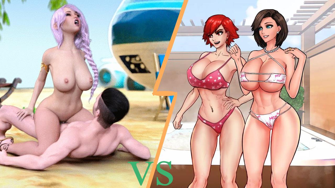
In 95% of scenarios, 2D has both a higher ceiling and a lower floor.
Most developers’ first 3D games are often made with a program like default settings, resulting in a very same-y look across different games. It’s only when they get more experience and start changing things like lighting and custom settings that we reach graphics like those in Milfy City, Power Vacuum, and Treasure of Nadia.
2D games, on the other hand, vary wildly. This is because developers can use far more types of programs to create their artwork. That’s sometimes good, like in Summertime Saga, SexNote, and this sub’s oft-posted Another Chance. But it often results in a type of artwork that’s divisive and not readily accepted by mainstream consumers.
In other words, 3D artwork tends to lean towards the middle of the road on most titles, until the developer becomes experienced in creating artwork. 2D artwork can be a draw or a turn-off depending on the art style.
*New devs should use whatever they feel comfortable with/believe fits their creative vision the best, while remaining open to criticism so that they can improve.*
Just as writing, coding, and gameplay design get better with experience, so does art. This is plainly evident with “Shut Up and Dance” having a complete re-render before it goes live on Steam later this year: The developer started, slowly improved, and then decided to make the whole product better by going back and matching the quality across the board.
In other words, *don’t be afraid to make a game because you don’t know how to do one of the things required.* Nearly all successful designers started while not knowing how to do half their job. Messing up and learning is an inevitable part of the process and should be welcomed, not feared.
Damn, I should really take my own advice and make something…


