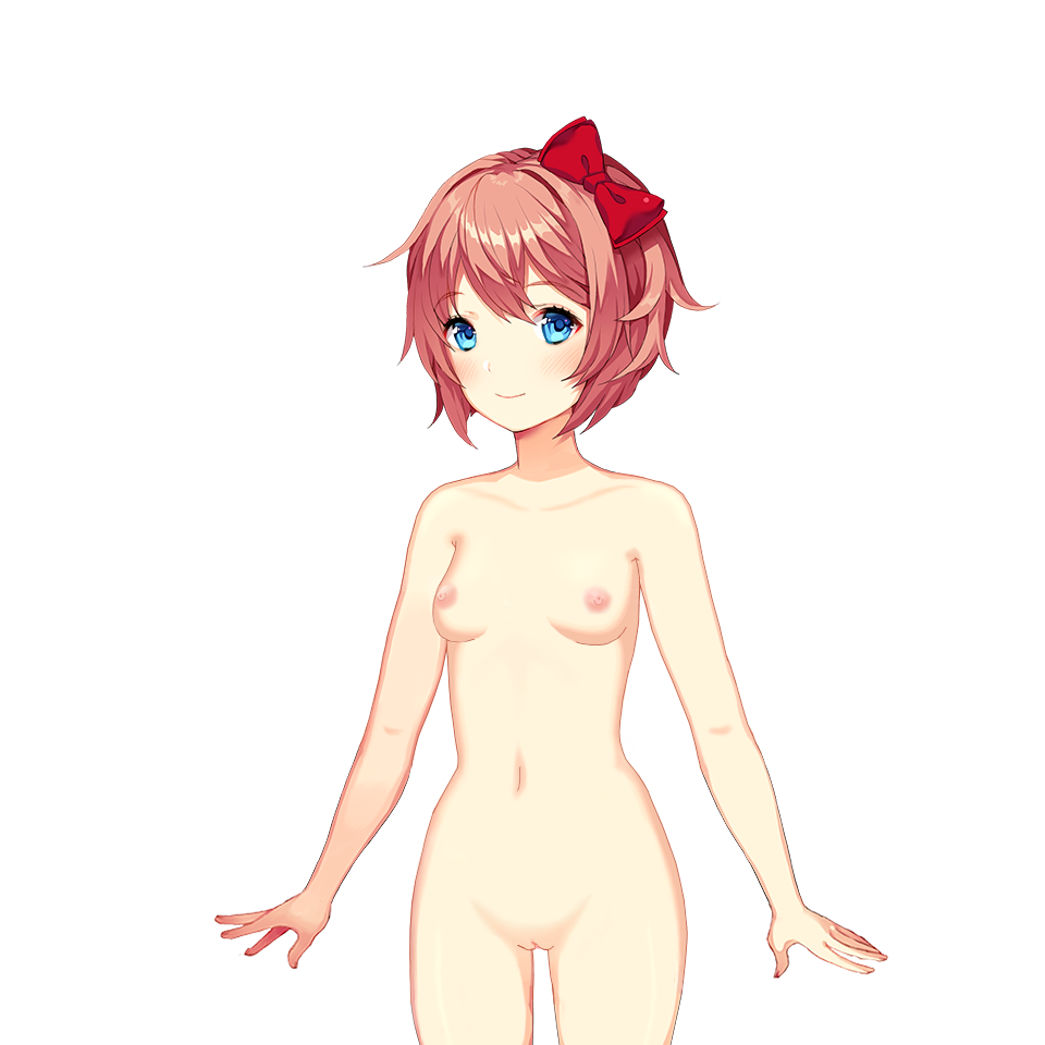
I think this one turned out better than my Monika. I tried not to follow Satchely’s style *too* strictly this time and do my own thing (softer shadows, changed original leg shading, added skin highlights), but not change enough that it would stand out from the original Sayori sprite. How’d I do?
Leave a comment


